UX design of analogue to digital product registration
T&H CX > Our Work > User Experience Case Studies > UX design of analogue to digital product registration
Project Overview
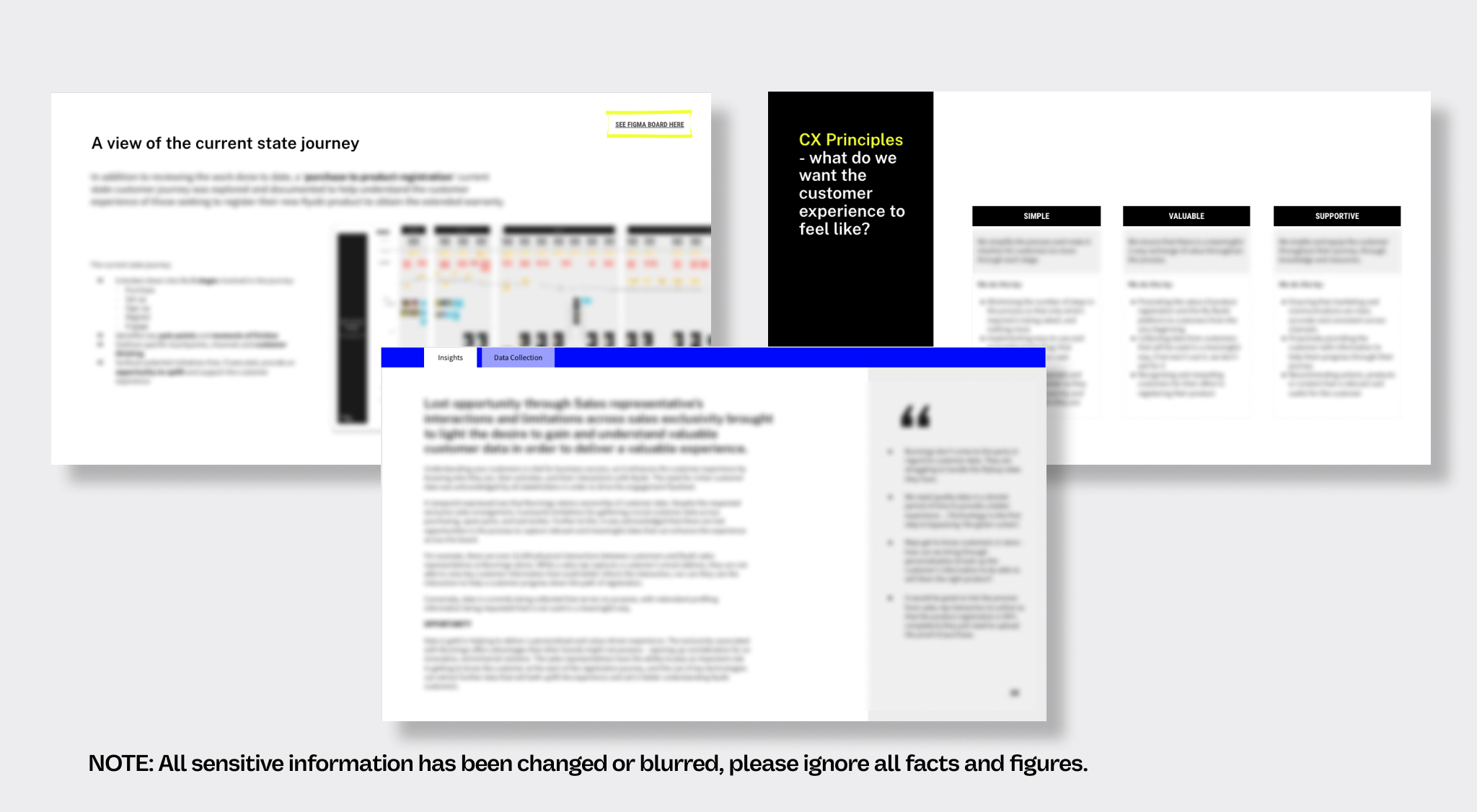
Ryobi engaged Tortoise & Hare to conduct a user experience audit on the current product purchase and registration experience, including in-store purchases, product unboxing, the analogue to digital experience and the My Ryobi portal itself.
When a customer purchases a new Ryobi tool, the My Ryobi website allows customers to gain instant and ongoing product value as they build their toolbox. To access the My Ryobi platform, customers first need to register their tool.
The output of this audit informed an innovative and realistic business case, with supporting prototypes, for Ryobi to improve the end-to-end customer experience across their channels.
Customer Objective
To mitigate friction and drive engagement across sign-up, registration and managing of products.
Business Objective
Increase product registration and customer engagement on the My Ryobi platform to better understand the needs and behaviours of the customers.
Ryobi (Australia) (Techtronic Industries Australia Pty Limited)
Ryobi is part of Techtronic Industries's (TTI) brand portfolio, a world-class leader in innovative products. Ryobi's primary aim is to provide quality tools and experiences for DIY enthusiasts. An effortless product registration process stands as a crucial component of their mission.
Industry:
Retail / Manufacturing
Company size:
10,000 + employees
Collaborated with T&H:
2022 - ongoing
T&H Services:

Approach
This project consisted of two primary phases: Discovery and Design.
Discovery
The project commenced with a comprehensive examination of the existing My Ryobi customer experience. This involved identifying customer pain points based on insights gathered from customers, competitor analysis, and a mystery shopping exercise. The entire customer journey, from purchasing a new tool to interacting with the My Ryobi website, was meticulously mapped out. Additionally, stakeholder interviews were conducted to gain insights into both the current state and the future goals of the My Ryobi experience.
Design
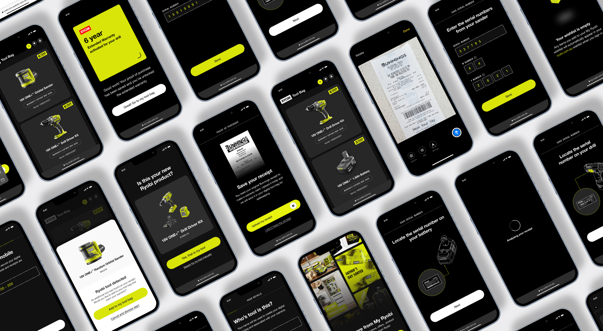
The insights gathered during the discovery phase and the collaborative sessions with the client served as the foundation for creating an exceptional future state design and prototype. This, in turn, supported the business case for an upcoming development project. Recognizing that achieving the 'ideal state' would take time, we also recommended implementing several minor improvements to enhance the current experience temporarily.

Results
The results of this audit played a pivotal role in pinpointing the primary areas where the Product and My Ryobi experience needed to enhance the customer experience on the My Ryobi website.
We provided quick win and hygiene improvements to enhance the current experience as a short-term solution, while also developing a comprehensive UX design and prototype to support the business case for achieving the ideal state. This endeavour aimed to position Ryobi as a company that was revolutionising the product registration experience.
By employing interactive, user-friendly, mobile-first design principles and incorporating cutting-edge technologies, we not only streamlined the My Ryobi customer experience but also made it engaging and seamless for customers after their purchase.
Looking for a service or industry specific case study?
A trusted partner to Australia’s leading customer-obsessed brands

Analysis & Opinion
Unlocking your test-and-learn potential starts with your culture
Developing a test-and-learn approach is critical to understand and validate the unique relationship between you and your customer.

T&H Insights & Predictions
Digital marketing trends for 2023 (that are not ChatGPT)
Find out why this CX agency’s 2023 top digital marketing trends list doesn’t include ChatGPT.

Analysis & Opinion
Lead nurturing isn't as sexy as lead generation but just as important
Lead generation isn't always the answer to business growth. Lead nurturing is a long play that ensures sales leads success.
